r_website
  • Home
  • Basics
    • Introduction
    • Basic objects
    • Data types
    • Loops and conditionals
    • Functions
  • Working with data
    • Loading data
    • Data wrangling
    • Joining and restructuring data
    • Vizualization vol 1
    • Vizualization vol 2
  • Analyzing data
    • Exploratory analysis
    • Simple regression
    • Statistical control
    • What next

On this page

  • Getting basic information about the dataset
  • Exploring via plots
    • A cautionary tale the boring way
    • A cautionary tale the fun way
  • Exercises

Exploratory Data Analysis

Usually once you get the data for your analysis the first thing you want to do is get to know it and briefly browse through it to know e.g. what variables are in the dataset, how many observations you have etc. You might feel the urge to jump right into answering your key research questions. After all, usually data collection is a laborious and tiring process and you are so curious to check what the results are! But it’s best to set aside the main analyses for a moment and first take a closer look at the data. Why? It is a necessary steps because there is a near-infinite number of things that can go wrong when preparing the data from errors in how data was coded to errors in preprocessing or loading the files. Lots of things can also happen that can make analysis or drawing conclusions difficult. These can range from issues with your measures (e.g. reliability) through unexpected behaviour of participants during the study (e.g. non-compliance, reactance, purposufely giving ridiculous answers) all the way to errors in the data (e.g. items not recoded or errors in coding, values out of range etc.). Generally exploring the data is not so much about writing/using proper functions but about thinking what could possibly be off with the data to prepare yourself before further analyses.

How to best get to know a new dataset? You can work with datasets from various sources. If it’s your study that you’re analyzing, then you probably know everything about the variables that should be in it, how many particiapnts took part in the study, how variables are coded etc. However, you might also be working with datasets provided by other people (e.g. by a colleague who ran the study, by a company, or you got the data from an open repository). In these situation it is crucial that you can get to know your data. Many of such datasets will have a codebook available which should describe it in detail. Unfortunately that is not always the case (codebook is like documentation - super important but nobody wants to do it). If a codebook is available, read it (this still does not allow you to skip checking for potential errors/problems with the data). If you don’t have a codebook you need to check everything yourself. Fortunately there is a lot of functions in R that make it a lot easier.

Lets starts with just general first look at the data. We might want to see how many observations we have, how many columns there are, and the names and types of columns. dplyr has a very nice function for it called glimpse(). It’s more concise than str() but gives you more information than e.g. head(). We will work with a dataset on bike sharing. The dataset is powered by TfL Open Data. and contains OS data © Crown copyright and database rights 2016’ and Geomni UK Map data © and database rights [2019]. You can find the link to the data as well as codebook for variables here. Lets load our dataset and have a firsty look at it!

library(tidyverse)

theme_set(theme_minimal(base_size = 15))

bikes <- read_csv("data/london_merged.csv")
glimpse(bikes)
Rows: 17,414
Columns: 10
$ timestamp    <dttm> 2015-01-04 00:00:00, 2015-01-04 01:00:00, 2015-01-04 02:…
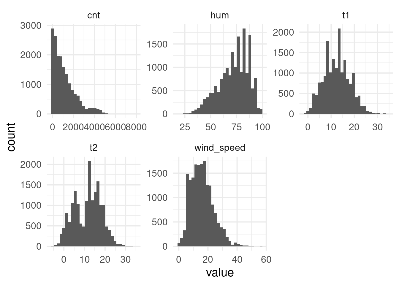
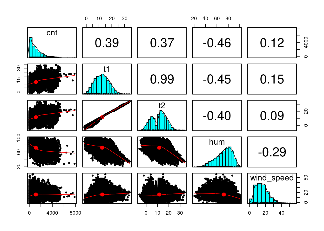
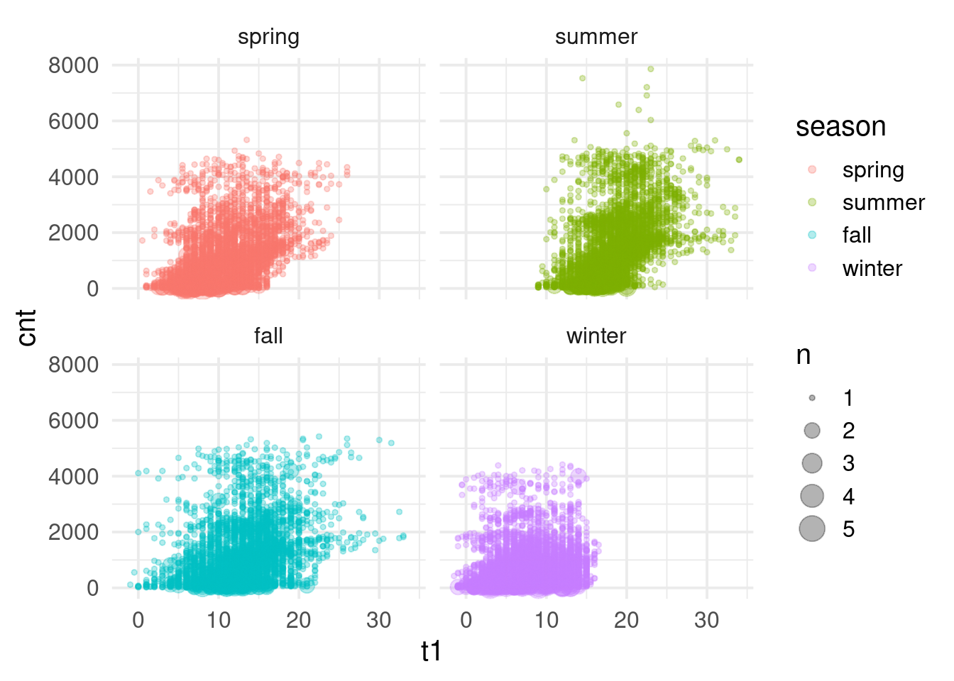
$ cnt          <dbl> 182, 138, 134, 72, 47, 46, 51, 75, 131, 301, 528, 727, 86…
$ t1           <dbl> 3.0, 3.0, 2.5, 2.0, 2.0, 2.0, 1.0, 1.0, 1.5, 2.0, 3.0, 2.…
$ t2           <dbl> 2.0, 2.5, 2.5, 2.0, 0.0, 2.0, -1.0, -1.0, -1.0, -0.5, -0.…
$ hum          <dbl> 93.0, 93.0, 96.5, 100.0, 93.0, 93.0, 100.0, 100.0, 96.5, …
$ wind_speed   <dbl> 6.0, 5.0, 0.0, 0.0, 6.5, 4.0, 7.0, 7.0, 8.0, 9.0, 12.0, 1…
$ weather_code <dbl> 3, 1, 1, 1, 1, 1, 4, 4, 4, 3, 3, 3, 4, 3, 3, 3, 3, 3, 3, …
$ is_holiday   <dbl> 0, 0, 0, 0, 0, 0, 0, 0, 0, 0, 0, 0, 0, 0, 0, 0, 0, 0, 0, …
$ is_weekend   <dbl> 1, 1, 1, 1, 1, 1, 1, 1, 1, 1, 1, 1, 1, 1, 1, 1, 1, 1, 1, …
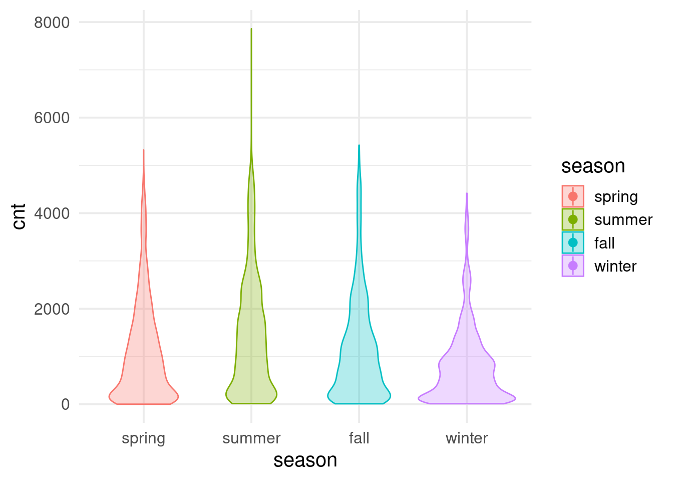
$ season       <dbl> 3, 3, 3, 3, 3, 3, 3, 3, 3, 3, 3, 3, 3, 3, 3, 3, 3, 3, 3, …

Getting basic information about the dataset

Before we do any analysis there are a few things to clean. Firstly some variables are factors according to the codebook but are coded as numeric.

bikes <- bikes %>%
  mutate(across(c("weather_code", "is_holiday", "is_weekend", "season"), as.factor))

There are also a few variables that are coded with numbers but have corresponding values: weather_code and season. Recoding them will make it easier to work with them (we will use slightly abbreviated names for weather_code to keep them more readable).

bikes <- bikes %>%
  mutate(season = recode(season, "0" = "spring", "1" = "summer", "2" = "fall", "3" = "winter"),
         weather_code = recode(weather_code, "1" = "clear", "2" = "scattered clouds", 
                               "3" = "Broken clouds", "4" = "Cloudy ", 
                               "7" = "Rain", "10" = "rain with thunderstorm", 
                               "26" = "snowfall", "94" = "Freezing Fog"))

There is a number of things we might want to look at to get to know the data better. Lets start with the numeric columns. A good point to start is to look at some summary statistics like means, standard deviations, minimum and maximum values (we’ll use knitr::kable() just to make the table look nicer in the output).

bikes %>%
  select(is.numeric) %>%
  pivot_longer(cols = everything(), names_to = "variable", values_to = "value") %>%
  group_by(variable) %>%
  summarize(mean = mean(value, na.rm = T), 
                                           sd = sd(value, na.rm = T),
                                           min = min(value, na.rm = T), 
                                           max = max(value, na.rm = T)) %>%
  knitr::kable()
Warning: Use of bare predicate functions was deprecated in tidyselect 1.1.0.
ℹ Please use wrap predicates in `where()` instead.
  # Was:
  data %>% select(is.numeric)

  # Now:
  data %>% select(where(is.numeric))
variable mean sd min max
cnt 1143.10164 1085.108068 0.0 7860.0
hum 72.32495 14.313186 20.5 100.0
t1 12.46809 5.571818 -1.5 34.0
t2 11.52084 6.615145 -6.0 34.0
wind_speed 15.91306 7.894570 0.0 56.5

We can also look at other variables that aren’t numeric - lets look at the weather_code variable as an example. Lets see which countries are available and for which countries we have the most reviews. We can do it by combining count() with arrange().

bikes %>%
  count(weather_code) %>%
  arrange(desc(n))
# A tibble: 7 × 2
  weather_code                 n
  <fct>                    <int>
1 "clear"                   6150
2 "scattered clouds"        4034
3 "Broken clouds"           3551
4 "Rain"                    2141
5 "Cloudy "                 1464
6 "snowfall"                  60
7 "rain with thunderstorm"    14

If we just want to get information on which countries are in the data we can use unique():

unique(bikes$weather_code)
[1] Broken clouds          clear                  Cloudy                
[4] Rain                   scattered clouds       snowfall              
[7] rain with thunderstorm
7 Levels: clear scattered clouds Broken clouds Cloudy  ... snowfall

The psych package also has a pretty useful function that can give you multiple summaries very quickly. It’s called describe(). It takes a data frame or a matrix as an argument and can provide a lot of summary statistics for numeric variables such as the mean, median, standard deviation, standard error, skew, kurtosis and quantiles. You can specify which of these you want by setting additional arguments. We will also round numeric values using mutate() and across().

library(psych)

Attaching package: 'psych'
The following objects are masked from 'package:ggplot2':

    %+%, alpha
bikes %>%
  select(where(is.numeric)) %>%
  describe() %>%
  mutate(across(is.numeric, \(x) round(x, 2))) %>%
  knitr::kable()
vars n mean sd median trimmed mad min max range skew kurtosis se
cnt 1 17414 1143.10 1085.11 844.0 973.26 972.59 0.0 7860.0 7860.0 1.33 1.54 8.22
t1 2 17414 12.47 5.57 12.5 12.36 5.93 -1.5 34.0 35.5 0.20 -0.26 0.04
t2 3 17414 11.52 6.62 12.5 11.56 7.41 -6.0 34.0 40.0 -0.06 -0.66 0.05
hum 4 17414 72.32 14.31 74.5 73.31 14.83 20.5 100.0 79.5 -0.57 -0.26 0.11
wind_speed 5 17414 15.91 7.89 15.0 15.35 7.41 0.0 56.5 56.5 0.67 0.45 0.06

Sometimes you want summary statistics grouped by some categorical variable (e.g. experimental condition). You can do it with describe.by() from psych package. It works the same way as describe() you just need to provide the group argument which tells R what variable to split the dataset by. Lets look at the dataset split by season.

describeBy(t1 + t2 + hum + cnt ~ season, data = bikes, mat=TRUE)%>%
  mutate(across(is.numeric, \(x) round(x, 2))) %>%
  knitr::kable()
item group1 vars n mean sd median trimmed mad min max range skew kurtosis se
t11 1 spring 1 4394 10.67 4.02 10.0 10.50 4.45 0.5 26.0 25.5 0.42 0.00 0.06
t12 2 summer 1 4387 18.43 3.62 18.0 18.29 2.97 9.0 34.0 25.0 0.49 0.78 0.05
t13 3 fall 1 4303 13.04 4.29 13.0 13.01 3.71 -1.0 33.0 34.0 0.18 1.06 0.07
t14 4 winter 1 4330 7.69 3.79 7.5 7.68 4.45 -1.5 16.5 18.0 0.04 -0.80 0.06
t21 5 spring 2 4394 9.42 5.10 9.0 9.31 5.93 -2.5 26.0 28.5 0.19 -0.75 0.08
t22 6 summer 2 4387 18.39 3.63 18.0 18.26 2.97 6.0 34.0 28.0 0.41 1.03 0.05
t23 7 fall 2 4303 12.51 5.06 13.0 12.70 4.45 -4.5 32.5 37.0 -0.30 0.61 0.08
t24 8 winter 2 4330 5.71 4.88 5.0 5.59 5.19 -6.0 16.5 22.5 0.29 -0.96 0.07
hum1 9 spring 3 4394 68.60 15.23 71.0 69.28 16.31 23.0 100.0 77.0 -0.37 -0.65 0.23
hum2 10 summer 3 4387 66.85 15.13 68.0 67.37 17.79 20.5 97.0 76.5 -0.29 -0.77 0.23
hum3 11 fall 3 4303 76.10 12.21 77.0 76.92 12.60 31.0 100.0 69.0 -0.60 -0.05 0.19
hum4 12 winter 3 4330 77.91 10.90 79.0 78.43 11.86 36.0 100.0 64.0 -0.44 -0.17 0.17
cnt1 13 spring 4 4394 1103.83 1039.00 823.0 945.91 973.33 0.0 5322.0 5322.0 1.21 0.99 15.67
cnt2 14 summer 4 4387 1464.47 1250.76 1214.0 1299.39 1322.48 12.0 7860.0 7848.0 0.99 0.55 18.88
cnt3 15 fall 4 4303 1178.95 1095.65 898.0 1009.91 1000.76 9.0 5422.0 5413.0 1.31 1.48 16.70
cnt4 16 winter 4 4330 821.73 807.44 632.0 684.04 687.93 10.0 4415.0 4405.0 1.63 2.94 12.27

Exploring via plots

Doing numeric exploration is always useful and can give you plenty of information about a dataset but in many situations a plot makes exploration much easier. It allows you to immediately spot certain problems like implausible outliers, weird (e.g. censored) distributions or types of relations (is it linear? quadratic? Does it make sense at all?). Lets look at some quick summaries of our variables with plots. We can start by simple histograms of numeric variables and a scatterplot to show the relation between numeric variables:

bikes %>%
  select(where(is.numeric)) %>%
  pivot_longer(cols = everything(), names_to = "var", values_to = "value") %>%
  ggplot(aes(x = value)) +
  geom_histogram(bins = 30) +
  facet_wrap(~var, scales = "free")

We can immediately see the skew in some of the variables. You can also get a rough look at bivariate relations with pairs.panels() function from psych package:

pairs.panels(bikes %>% select(where(is.numeric)))

It shows bivariate scatterplots, correlations and distributions for all the numeric variables. You can quickly see e.g. that actual and felt temperature are pretty much the same with correlation of .99.

Lets focus in a bit more detail on some of the variables like count, temperature and season.

Lets start by looking at distributions of counts across seasons:

bikes %>%
  ggplot(aes(x = season, y = cnt, fill = season, color = season)) +
  geom_violin(alpha = .3) +
  stat_summary(fun.data = "mean_cl_boot", geom = "pointrange")
Warning: Computation failed in `stat_summary()`.
Caused by error in `fun.data()`:
! The package "Hmisc" is required.

We can see that summer has a much longer tail - there are some measurements with way moire counts than in other seasons and that there are much more low counts in the winter. We can also look at relations between e.g. temperature and counts in each season:

bikes %>%
  ggplot(aes(x = t1, y = cnt, color = season)) +
  geom_count(alpha = .3) +
  facet_wrap(~season)

Unsurprisingly there are much lower temperatures in the winter.

A cautionary tale the boring way

One of the reasons why plotting is very important and useful is that all sorts of data can provide you the same point estimate (like a mean or a regression slope). The most common example is the Anscombe quartet. It’s a set of 4 datasets with x and y variable each. Each of these have exactly the same correlation coefficient between x and y so you might be tempted to say they are pretty much the same, right? But if you plot them you’ll see this:

Even though the regression line is the same on each plot you can immediately see that it makes sense only in the first one (top left). The top right one shows a quadratic and not a linear relation. The bottom left one clearly has an outlier that drives the regression line to be steeper. And the bottom right one shows pretty much no relation because entire variation in x is driven by a single data point. If we didn’t plot the data we wouldn’t realize just how different these datasets are. You could discover this in some numerical way (e.g. looking at regression diagnostics) but plotting makes it much faster and allows you to immediately spot the problem.

A cautionary tale the fun way

There is a more fun way to see the same point that was made by Anscombe. We’ll look at an experiment that was conducted to test how displaying information in the media affects attitude towards migrants. The researchers showed participants either a negative article or a neutral one and measured attitudes towards migrants. They also measured general exposure to the media (ie how much media does one consume) because they were interested in the relation between media consumption and attitudes towards migrants. They also recorded gender and age of participants. Lets load the data:

Rows: 1,700
Columns: 5
$ gender         <chr> "female", "male", "male", "female", "female", "female",…
$ age            <dbl> 35, 35, 38, 18, 44, 50, 58, 53, 45, 35, 20, 58, 34, 35,…
$ condition      <chr> "control", "control", "control", "experimental", "contr…
$ media_exposure <dbl> 9.82, 9.54, 5.00, 9.22, 8.54, 6.60, 5.04, 4.54, 5.92, 1…
$ att_migrants   <dbl> 6.12, -0.62, -2.12, 5.68, 6.00, 0.54, 5.70, 7.04, 6.12,…

Lets look at some summary statistics first:

experiment %>%  
  group_by(condition) %>%  
  summarise(mean_att = mean(att_migrants),
            se_att = sd(att_migrants)/sqrt(n())) %>% 
  knitr::kable()
condition mean_att se_att
control 3.172235 0.1107740
experimental 3.149035 0.1085498

Well, it does not look like there are any meaningful differences between the conditions. We can also plot these differences:

experiment %>%   
  ggplot(aes(x = condition, y = att_migrants)) +  
  stat_summary(fun.data = "mean_se", geom = "pointrange") +  
  coord_cartesian(ylim = c(0,5))

This is a bit disappointing. We could say that we did not reject the null hypothesis and there is no support in the data that reading a negative article affect attitudes towards migrants relative to reading a neutral article. Lets at least look at the correlation between media exposure and attitude towards migrants. Maybe there is something interesting there? We can use the cor() function for it:

cor(experiment$media_exposure, experiment$att_migrants)
[1] -0.2702737

Well the correlation seems negative and it definitely is not small. Maybe we are finally on to something! So lets finally plot the data to see how it looks like:

experiment %>% 
  ggplot(aes(x = media_exposure, y = att_migrants)) + 
  geom_point() + 
  geom_smooth(method = "lm")
`geom_smooth()` using formula = 'y ~ x'

Whoops! This obviously makes no sense. We get a plot of a gorilla. This dataset is fabricated! This example is taken fully from a paper: Yanai, I, Lercher, M. (2020). A Hypothesis is a liability. Genome Biology, 21, 231. What they did was provide students with a very similar dataset as above and randomly assign their students into one of two condition: half the students were asked to test a specific hypothesis and half to just analyze the dataset. The researchers were interested how many students would find the gorilla. They found (although the sample was small) that students who were asked to test specific hypothesis were less likely to find the gorilla in the data than the students that were not assigned a specific hypothesis to test. This of course dos not mean we should throw hypotheses away. However it shows that being too focused on testing very specific things with our data we can miss some really big errors and unless we explore the data properly we might make terrible mistakes.

The key takeaway is that a lot of things that are wrong or at least problematic can be immediately spotted when you plot the data. e.g. in when comparing two conditions of an experiment you might spot that the whole effect is driven but just a few outliers. Or that some values are out of range. There are of course limits to what a plot can provide (if you want to quantify then you need more than a plot) but they often work very well for initial screening.

Exercises

Download the dataset and its codebook

  1. Look at the dataset and its codebook. Try to validate the data and make sure all variables are coded correctly
  2. Explore the data with plots - does the data look ok?