r_website
  • Home
  • Basics
    • Introduction
    • Basic objects
    • Data types
    • Loops and conditionals
    • Functions
  • Working with data
    • Loading data
    • Data wrangling
    • Joining and restructuring data
    • Vizualization vol 1
    • Vizualization vol 2
  • Analyzing data
    • Exploratory analysis
    • Simple regression
    • Statistical control
    • What next

On this page

  • Plotting data
    • Some base R graphics
    • Enter ggplot2
    • Grammar of graphics
    • Aesthetics
    • Geometries
    • Attributes
    • Scales
    • Colors
    • Positions

Data visualization part 1

Plotting data

Visualization is an indispensible part of data analysis. If done properly it allows us to understand a lot more about our analysis/data and to understand it much faster than by wading through text. It also looks really nice! And good news is that R is absolutely great for plotting! In this class we’ll look at some basic R plotting functions first and then dive into the world of ggplot2, easily the best plotting package out there.

In this class we’ll use the midwest dataset from ggplot2 package. It stores a bunch of information about population of 5 midwestern states: Illinois, Indiana, Michigan, Ohio and Wisconsin. The data are at county level. Lets briefly look at our dataset for this class (all the variables are also described here):

library(tidyverse)
── Attaching core tidyverse packages ──────────────────────── tidyverse 2.0.0 ──
✔ dplyr     1.1.4     ✔ readr     2.1.5
✔ forcats   1.0.0     ✔ stringr   1.5.1
✔ ggplot2   3.5.1     ✔ tibble    3.2.1
✔ lubridate 1.9.3     ✔ tidyr     1.3.1
✔ purrr     1.0.2     
── Conflicts ────────────────────────────────────────── tidyverse_conflicts() ──
✖ dplyr::filter() masks stats::filter()
✖ dplyr::lag()    masks stats::lag()
ℹ Use the conflicted package (<http://conflicted.r-lib.org/>) to force all conflicts to become errors
data("midwest")
glimpse(midwest)
Rows: 437
Columns: 28
$ PID                  <int> 561, 562, 563, 564, 565, 566, 567, 568, 569, 570,…
$ county               <chr> "ADAMS", "ALEXANDER", "BOND", "BOONE", "BROWN", "…
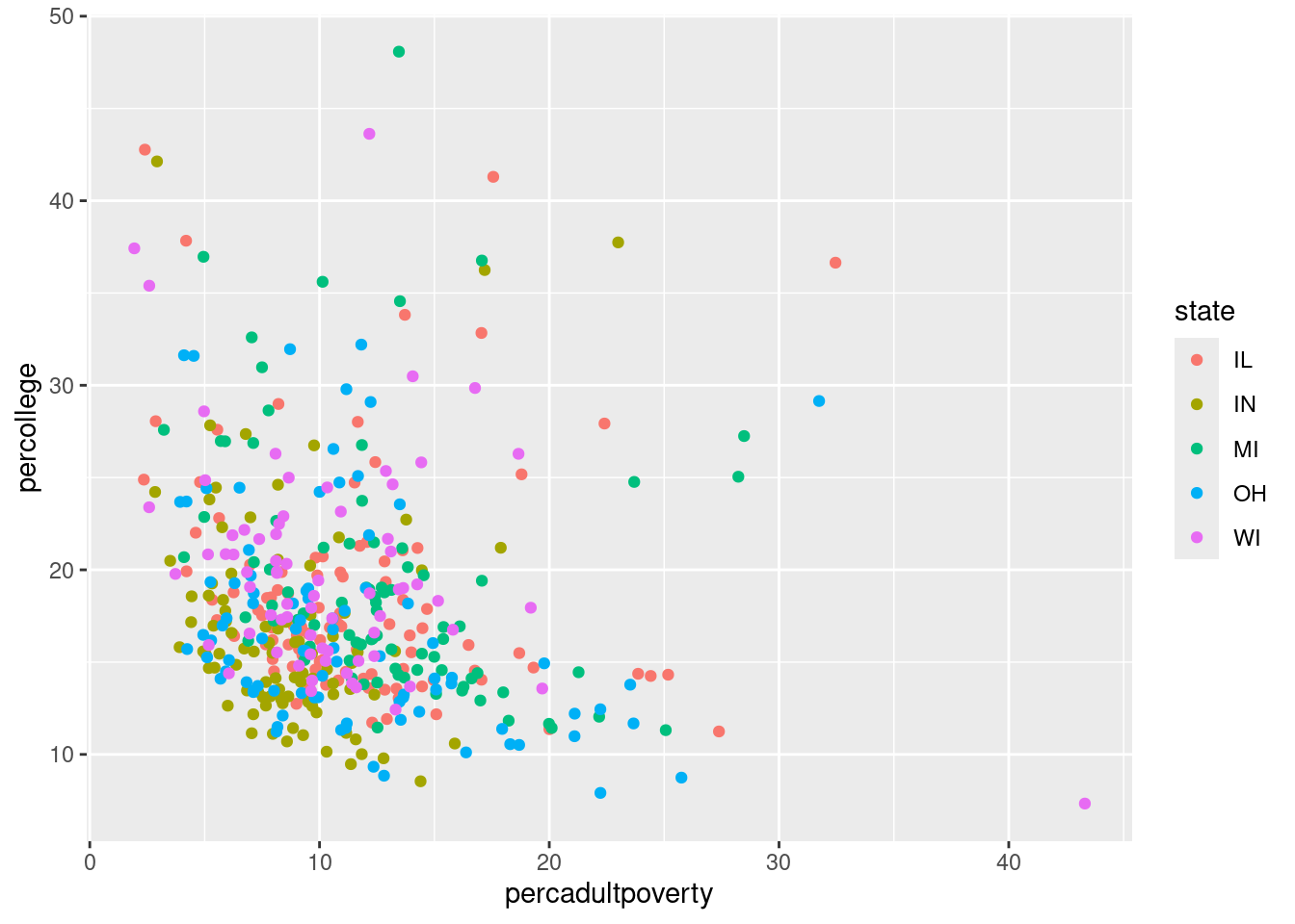
$ state                <chr> "IL", "IL", "IL", "IL", "IL", "IL", "IL", "IL", "…
$ area                 <dbl> 0.052, 0.014, 0.022, 0.017, 0.018, 0.050, 0.017, …
$ poptotal             <int> 66090, 10626, 14991, 30806, 5836, 35688, 5322, 16…
$ popdensity           <dbl> 1270.9615, 759.0000, 681.4091, 1812.1176, 324.222…
$ popwhite             <int> 63917, 7054, 14477, 29344, 5264, 35157, 5298, 165…
$ popblack             <int> 1702, 3496, 429, 127, 547, 50, 1, 111, 16, 16559,…
$ popamerindian        <int> 98, 19, 35, 46, 14, 65, 8, 30, 8, 331, 51, 26, 17…
$ popasian             <int> 249, 48, 16, 150, 5, 195, 15, 61, 23, 8033, 89, 3…
$ popother             <int> 124, 9, 34, 1139, 6, 221, 0, 84, 6, 1596, 20, 7, …
$ percwhite            <dbl> 96.71206, 66.38434, 96.57128, 95.25417, 90.19877,…
$ percblack            <dbl> 2.57527614, 32.90043290, 2.86171703, 0.41225735, …
$ percamerindan        <dbl> 0.14828264, 0.17880670, 0.23347342, 0.14932156, 0…
$ percasian            <dbl> 0.37675897, 0.45172219, 0.10673071, 0.48691813, 0…
$ percother            <dbl> 0.18762294, 0.08469791, 0.22680275, 3.69733169, 0…
$ popadults            <int> 43298, 6724, 9669, 19272, 3979, 23444, 3583, 1132…
$ perchsd              <dbl> 75.10740, 59.72635, 69.33499, 75.47219, 68.86152,…
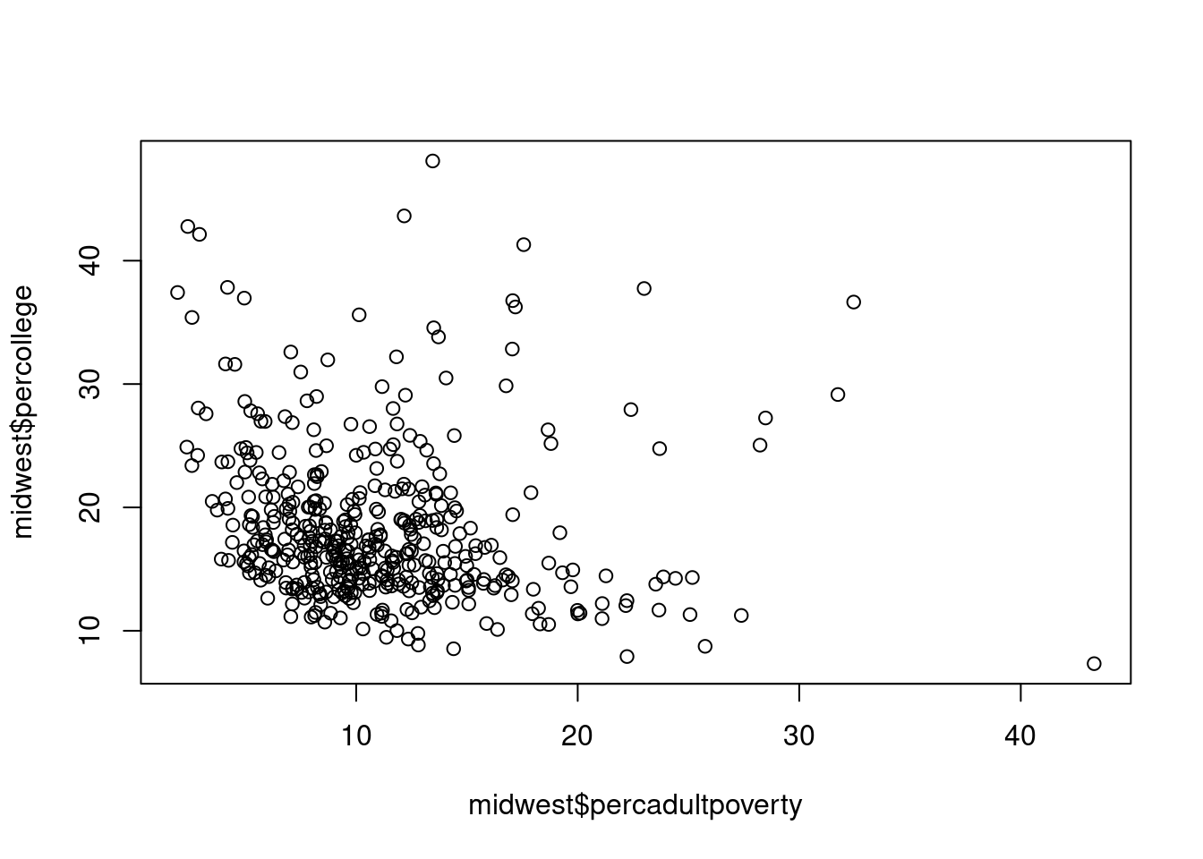
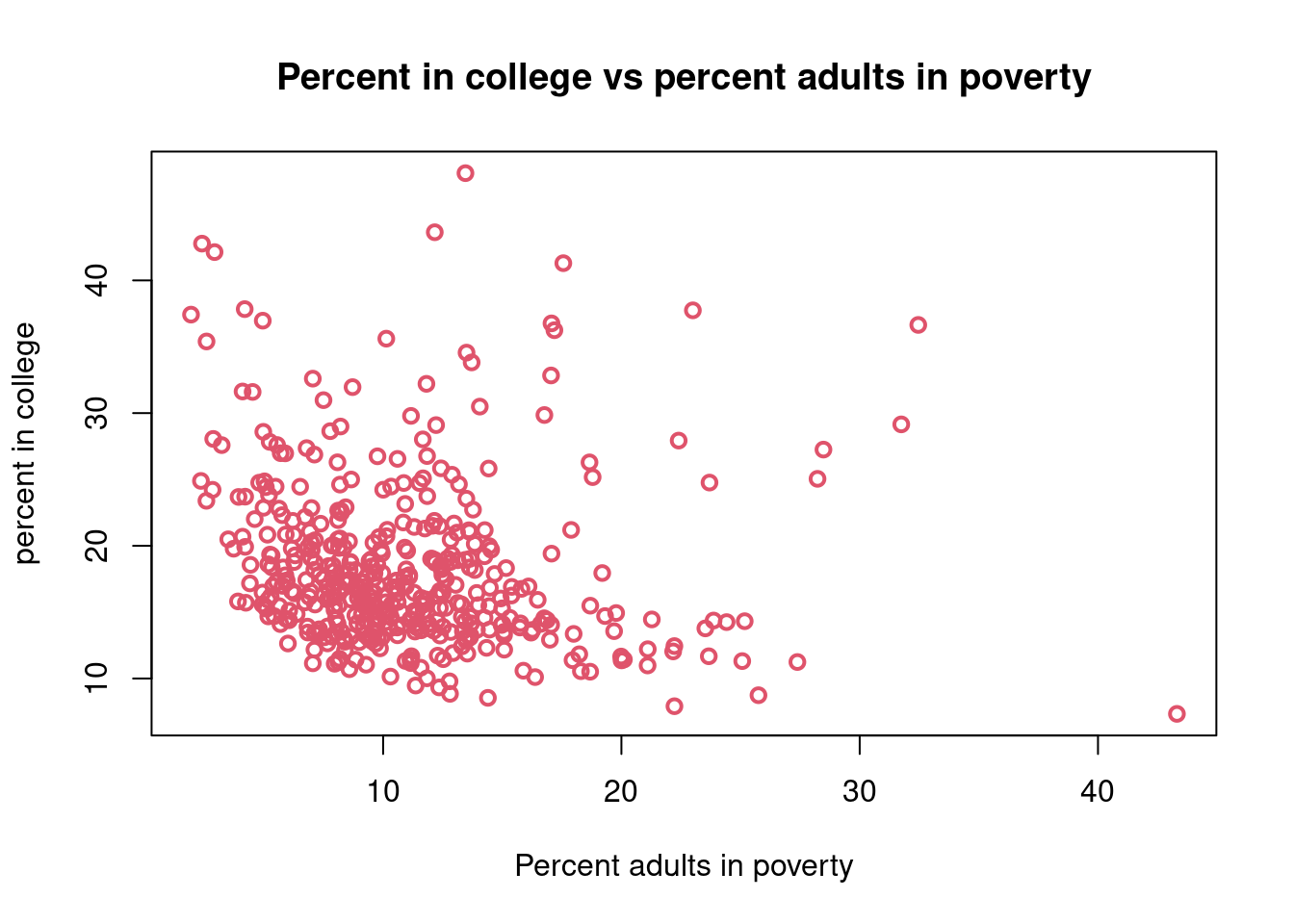
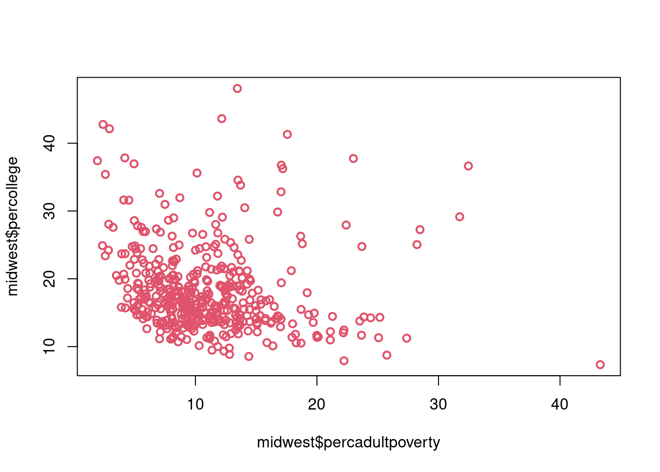
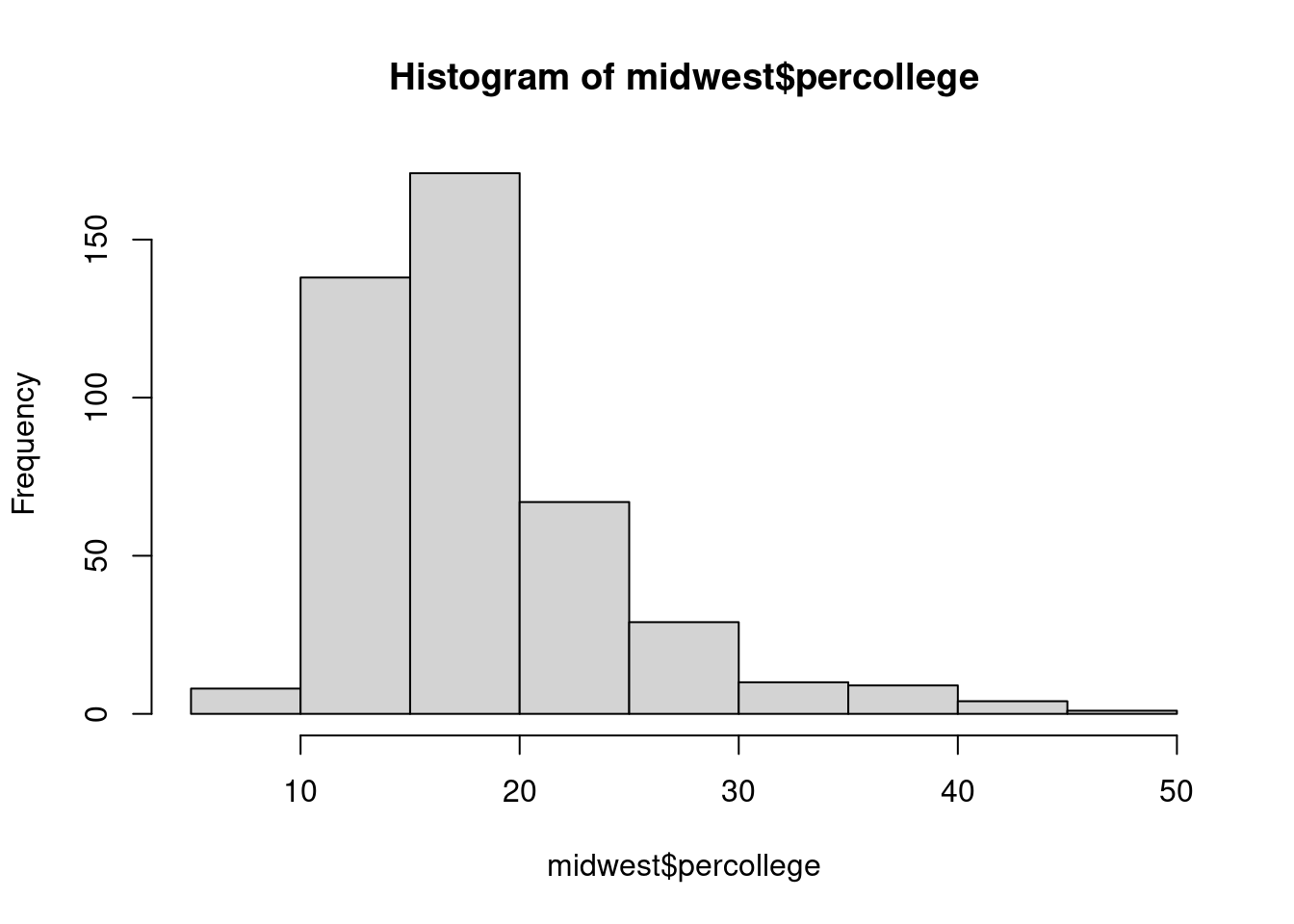
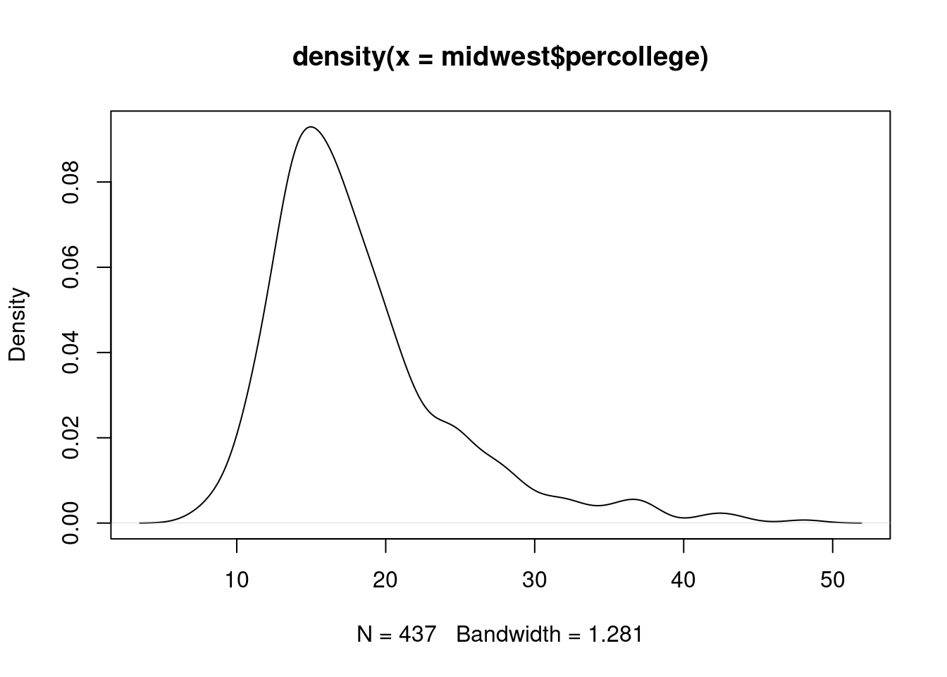
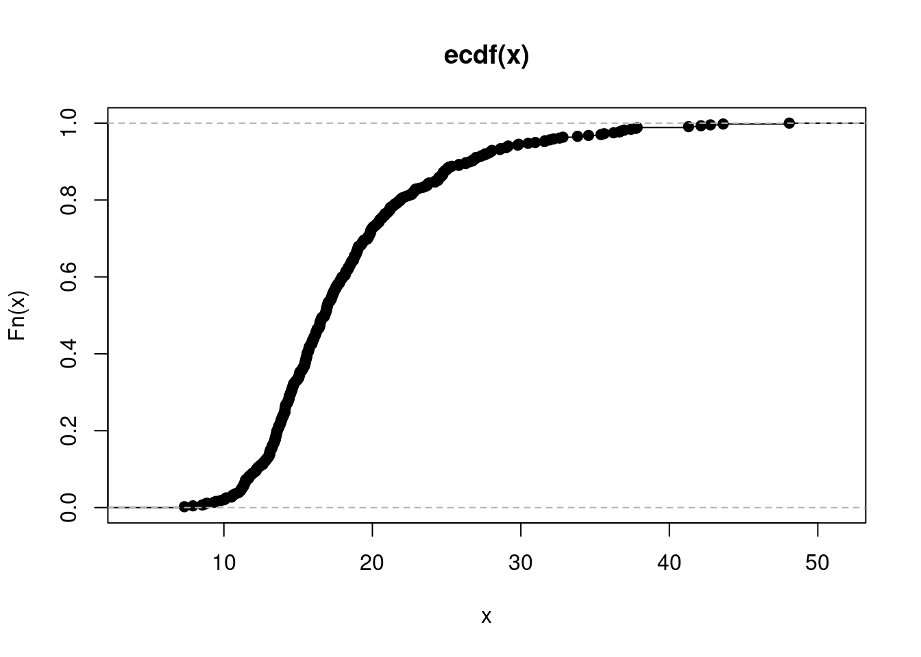
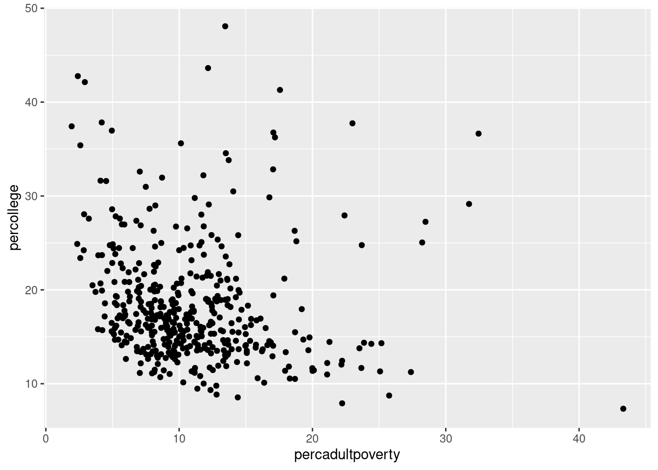
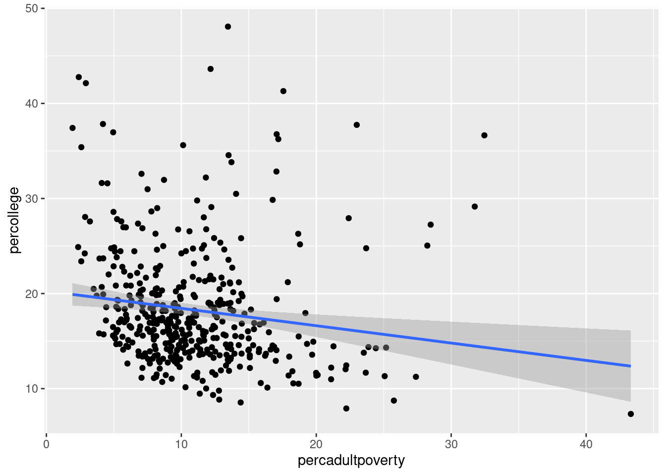
$ percollege           <dbl> 19.63139, 11.24331, 17.03382, 17.27895, 14.47600,…
$ percprof             <dbl> 4.355859, 2.870315, 4.488572, 4.197800, 3.367680,…
$ poppovertyknown      <int> 63628, 10529, 14235, 30337, 4815, 35107, 5241, 16…
$ percpovertyknown     <dbl> 96.27478, 99.08714, 94.95697, 98.47757, 82.50514,…
$ percbelowpoverty     <dbl> 13.151443, 32.244278, 12.068844, 7.209019, 13.520…
$ percchildbelowpovert <dbl> 18.011717, 45.826514, 14.036061, 11.179536, 13.02…
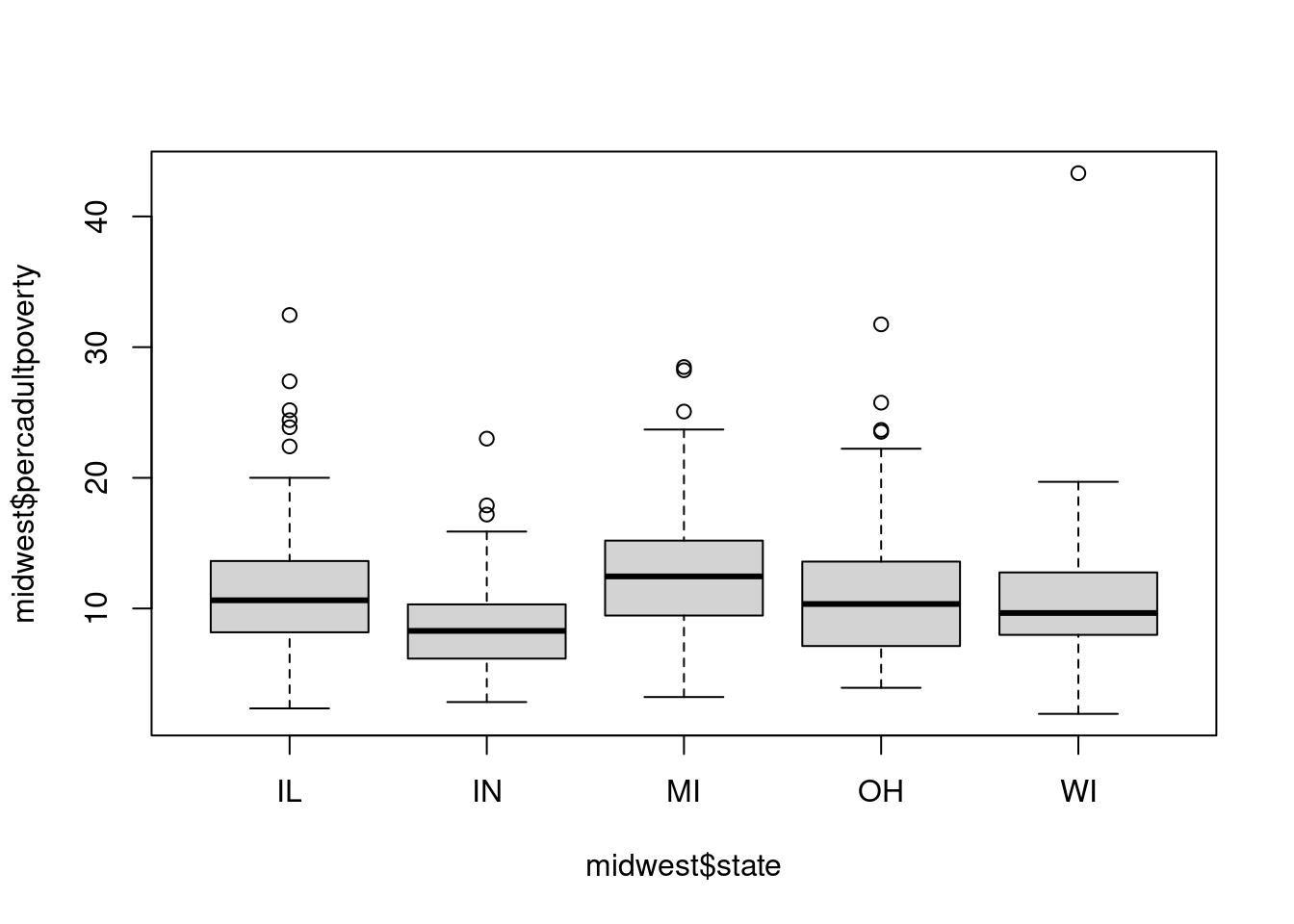
$ percadultpoverty     <dbl> 11.009776, 27.385647, 10.852090, 5.536013, 11.143…
$ percelderlypoverty   <dbl> 12.443812, 25.228976, 12.697410, 6.217047, 19.200…
$ inmetro              <int> 0, 0, 0, 1, 0, 0, 0, 0, 0, 1, 0, 0, 0, 1, 0, 1, 0…
$ category             <chr> "AAR", "LHR", "AAR", "ALU", "AAR", "AAR", "LAR", …

Some base R graphics

Before we move on to ggplot2 lets look at some built-in base R graphics. The graphics and stats packages have some function for plotting already available.

  • The most generic is the plot() function. It allows you to create simple plots in R. The first arguments are usually the variables you want to map onto the axes:

    plot(midwest$percadultpoverty, midwest$percollege)

  • plot() function has a bunch of arguments you can use to customize the plot. For example we can change the color and thickness of the points and add a title to the plot and axes:

    plot(midwest$percadultpoverty, midwest$percollege, col = 2, lwd = 2,
         main = "Percent in college vs percent adults in poverty",
         xlab = "Percent adults in poverty",
         ylab = "percent in college")

    Unfortunately the plot() function does not have great documentation and finding some of the arguments can be quite difficult. Some of these arguments also have very unintuitive names (e.g. argument named lty specifies line type, good luck memorizing that!). Base R has additional functions for more specific plots. Namely, lines() will create a line plot, points() will create a scatterplot and boxplot() will create a boxplot. These functions have better documentation than the general plot() though I still don’t consider it great. Lets see some of these in action. lines() and points() require that you first initialize the plots with the coordinates set to the variables of interest with the plot() function. You can specify what kind of plot (line plot, scatterplot etc) you want inside plot() by setting the type argument. E.g. setting it to l will create a line plot.

  • Lines: Lets say we want to make a line plot that will display the 10th, 50th and 90th quantile of percent of adults in poverty in all states. We’ll also introduce the axis() function which gives you some control over how the x and y axis should look like. Here we need it because lines() does not like categorical values at x axis so we need to add the state names (we add them at the top) with axis():

    #get the quantiles
    library(dplyr)
    #calculate quantiles at of percadultpoverty for each state
    list_q <- tapply(midwest$percadultpoverty, midwest$state, quantile, c(.1,.5,.9))
    
    #convert the result into a dataframe with each column as one quantile and each row as one state
    df_q <- data.frame()
    df_q <- bind_rows(list_q[[1]], list_q[[2]], list_q[[3]], list_q[[4]], list_q[[5]])
    colnames(df_q) <- c("q_10", "q_50", "q_90")
    
    #plot them
    plot(1:5, df_q$q_10, ylim = c(0,20), type = "l", col = 2, lwd = 2, lty = 2)
    lines(1:5, df_q$q_50, col = 4, lwd = 2, lty = 1)
    lines(1:5, df_q$q_90, col = 2, lwd = 2, lty = 2)
    axis(side = 3, at = 1:5, labels = unique(midwest$state))

    One important thing here: notice how each element is added to the plot on a new line. These functions are not chained together in any way and we are not saving any intermediate objects. This is pretty unusual in R (although perfectly normal in other programming languages). It’s just how base R plotting works.

  • Points: We can recreate the plot that we made with the generic plot() function but using points():

    plot(midwest$percadultpoverty, midwest$percollege)
    points(midwest$percadultpoverty, midwest$percollege, col = 2, lwd = 2, 
         main = "Percent in college vs percent adults in poverty",
         xlab = "Percent adults in poverty",
         ylab = "percent in college")

  • Boxplots are useful for showing differences in distributions of some continuous variable between levels of some factor. For example lets say we want to

    boxplot(midwest$percadultpoverty ~ midwest$state)

There are also built-in functions for plotting distributions: hist() for histograms, plot(density()) for density functions and plot.ecdf() for cumulative distribution plots. Lets look at all 3 plots for percent of population in college:

hist(midwest$percollege)

plot(density(midwest$percollege))

plot.ecdf(midwest$percollege)

One problem with base R plots is that they are not intuitive. Lots of arguments have weird names and doing some things is really not so easy. Making more complicated plots (e.g. adding text annotations on the plot) is also generally hard to do. That’s why we’ll focus on ggplot2 which is much more intuitive and versatile.

Enter ggplot2

ggplot2 is a package in th tidyverse designed for making data visualizations. One of the great things about it is that it breaks down each plot into a number of layers that can be changed (more or less) independently. This idea is encapsulated in what is called the grammar of graphics.

Grammar of graphics

The name comes from a book by Leland Wilkinson under the same title. Basically making a plot with the grammar of graphics is like making a building with lego blocks with different colors. You can mix the colors of the blocks to get exactly the building you want. Similalry in ggplot2 you can use different layers to make the plot that you want (e.g. mix different datasets or add a line to a scatterplot). Ok, but what are those layers? In ggplot2 there are following layers:

  • Data: the datasets (usually data frames) you want to plot

  • Aesthetics: mapping between data and the plot, e.g. what is to be mapped to x and y axis

  • Geometry: shapes used to represent data

  • Statistics: any statistics like means or confidence intervals that you want to add

  • Coordinates: coordinates of the plot (axes limits, cartesian vs polar coordinates etc.)

  • Facets: this layer is used for making subplots (e.g. separate plot for each level of a categorical variable)

  • Theme: All non-data stuff like fonts, titles

You always start the plot with ggplot() function. All the lego blocks that you want to add are chained together with +. Lets see what happens when we pass the first layer, data, to our plot:

midwest %>%
  ggplot()

Hmm, we get en empty plot. Why is that? Well, all we supplied so far is the data we want to plot but we did not include any additional information so R doesn’t know yet what exactly should be displayed on the plot. We need to add the next layer: aesthetics.

Aesthetics

Aesthetics map what variables should be displayed on the plot in what way. In this layer you declare e.g. what should be on the x and y axis. The basic aesthetics (the list is not exhaustive) are:

  • x axis

  • y axis

  • colour: colour of points and lines (that includes borders of e.g. rectangles)

  • fill: colour of filling

  • alpha: transparency. 0 means completely transparent, 1 means not transparency

  • size: point size

  • linewidth: width of lines

  • linetype: type of line (e.g. dashed)

  • shape: shape of points (circles, rectangles, etc.)

  • labels: text

Aesthetics are declared within aes(). It can be declared within ggplot() function, separately or inside geoms (more on those in a second). Lets see what happens when we add aesthetics to our plot:

midwest %>%
  ggplot() +
  aes(x = percadultpoverty, y = percollege)

Now we got our axes! Notice there is no data on the plot though. That’s because so far we have declared which dataset to plot and which variables to map onto axes but we did not specify how to represent the data. This is declared in the next layer: geometry.

Geometries

After providing a dataset and aesthetics we have the variables and their mapping to axes on the plot. However, we still don’t have any shapes to actually represent the data. Do we want a scatter plot? Or maybe a bar plot? Or a line plot? The shapes used to represent the data are defined in the geometry layer. Generally all geometries start with geom_ so for example geom_point() will make a scatter plot while geom_bar() will make a bar plot.

Geometries differ in what aesthetics they accept. You can look up what these are by looking up help for a given geometry. Each geometry has all the aesthetics it accepts in its documentation. They also differ in what kinds of variables they expect (any combination of categorical vs continuous variables).

Lets expand the initial plot with geom_point() to make a scatterplot!

midwest %>%
  ggplot() +
  aes(x = percadultpoverty, y = percollege) +
  geom_point()

We got a plot very similar to the one we made with base R! We can customize it further if we want to. Lets say we want to represent each state with a different color. We just need to add a color aesthetic. R will add a legend automatically:

midwest %>%
  ggplot() +
  aes(x = percadultpoverty, y = percollege, color = state) +
  geom_point()

There is one more thing about geometries and aesthetics. Remember you can declare aesthetics in different places? You can set global aesthetics inside the ggplot() function. If you do so these aesthetics will be used by default by all geometries in that plot. You can also set aesthetics inside a given geometry (in fact you can even set a different dataset for a given geometry; this is what we meant by independence of layers) but then they will be used only for this particular geometry and won’t be inherited by other ones.

Compare the to plots below. They produce the same result:

midwest %>%
  ggplot(aes(x = percadultpoverty, y = percollege)) +
  geom_point()

And the second plot:

midwest %>%
  ggplot() +
  geom_point(aes(x = percadultpoverty, y = percollege))

Some common geometries you can encounter are as follows:

  • geom_histogram() and geom_density() for displaying distributions of continuous variables

  • geom_bar() for displaying counts of categorical variables (you can change counts to other summary statistic but more on that later)

  • geom_col() for displaying differences in some continuous variable between levels of a factor

  • geom_point(): your good old scatterplot

  • geom_boxplot()

  • geom_violin() a bit like boxplot but displays a distribution of a continuous variable for each level of a factor

  • geom_smooth() for displaying lines of best fit (e.g. from a linear model)

You can check them out if you want to to see how they look like.

Lets look at 2 thing in a bit more details with regard to geometries. First, lets look at combining geoms. We can add a line of best fit to our scatterplot if we want to by adding an additional geometry. geom_smooth() will use a GAM or LOESS by default (depending on how many unique values x variable has) but we can set it to a linear model by adding method = "lm". A linear model probably won’t do well here but it’s just for demonstration:

midwest %>%
  ggplot(aes(x = percadultpoverty, y = percollege)) +
  geom_point() +
  geom_smooth(method  ="lm")
`geom_smooth()` using formula = 'y ~ x'

See? Just like building with lego blocks.

Last thing before we move on: a few words on geom_bar() and geom_col(). They often get mixed up at the beginning because they both show bar plots. geom_bar() takes a single aesthetic and is generally used to display counts of some factor variable. For example if we wanted to see how many counties are there in each state we could use geom_bar() (later we’ll see how to display e.g. means of variables across levels of a factor):

midwest %>%
  ggplot(aes(x=state)) +
  geom_bar()

geom_col() takes at least 2 aesthetics: x and y. It needs one categorical and one continuous variable. By default it is going to sum all values in a given category. e.g. lets look at the sum of area of all counties in each of the states:

midwest %>%
  ggplot(aes(x=state, y = area)) +
  geom_col()

What if we wanted to look at the average county area in each state? We can e.g. first summarise the dataset and then pipe it to plot:

midwest %>%
  summarise(mean_area = mean(area), .by = state) %>%
  ggplot(aes(x = state, y = mean_area)) +
  geom_col()

Since ggplot2 is part of tidyverse it’s really easy to pipe a set of dplyr functions into a plot in a single call!

Attributes

There are situations in which you don’t want to set some feature to be represented by a given variable but to set them to a fixed value for the entire plot/geometry. For example you might want to set the color or size of all points in a scatter plot. That’s when you set attributes. They are declared inside geometries but outside of aesthetics. Lets say we want to take our scatterplot and change the transparency and color of the points. We can do it by defining them inside geometry. The names for the arguments are the same as for aesthetics. Just remember to use them outside of aes()!

midwest %>%
  ggplot() +
  geom_point(aes(x = percadultpoverty, y = percollege), color = "red", alpha = .3)

By the way, you can define colors either with hex values as RGB but you can also use one of the built-in colors in R. You can check all the names of those built-in colors with colors() function. Another neat thing is that in newer version of RStudio you can see the preview of the colors when you type them in a script.

One potential problem is when aesthetic and scale come into conflict. E.g. what will happen if we map color to state variable and then set it as attribute? Lets see:

midwest %>%
  ggplot() +
  geom_point(aes(x = percadultpoverty, y = percollege, color = state), color = "red", alpha = .3)

The attribute overrides the aesthetic. It’s something to remember about.

Scales

One more thing are functions for working with scales: they allow you to have more control over how each scale is represented (e.g. what the breaks and values are, should the scale be transformed). For example notice that R automatically chose some limits for the scales and displayed breaks (the values on the axes). You can have more control over that with the scale_ family of functions. It’s a family of functions because you need to declare: 1) which aesthetic you want to change and 2) what kind of scale you are working with (continuous, discrete or binned). So for example scale_x_continuous() allows you to customize a continuous x axis. The basic things that you can change inside the scale_ function are: breaks, labels, limits and the expand argument (the last one controls additional space - notice that e.g. on the x axis there is a little space on the left of 0 and there is similarly a little space to the right of the point with the highest percadultpoverty value).

Lets say now we want to work a little with our scales. Lets change the breaks to be every 5%, change the labels to be actually in percentage format (there is a very neat function in scales package called label_percent() that does that. We just need to set scale argument in it to 1 because in our dataset e.g. 10% is represented as 10 and not 0.1):

midwest %>%
  ggplot() +
  geom_point(aes(x = percadultpoverty, y = percollege), color = "red", alpha = .3) + scale_x_continuous(breaks = seq(0,40,5),labels = scales::label_percent(scale = 1)) +
  scale_y_continuous(breaks = seq(0,50,5),labels = scales::label_percent(scale = 1))

A cautionary tale about using limits in scale_ functions: These limits work by filtering the data to be plotted. This can be a serious problem because you basically lose data when plotting and only get a warning about it. This can be especially problematic if you are trying to display bars or ranges because if e.g. one side of an interval falls out of the limits, the entire range will not be displayed. Lets see what happens if we set limits on one of our axes:

midwest %>%
  ggplot() +
  geom_point(aes(x = percadultpoverty, y = percollege), color = "red", alpha = .3) + scale_x_continuous(breaks = seq(0,25,5),labels = scales::label_percent(scale = 1), limits = c(0, 25)) +
  scale_y_continuous(breaks = seq(0,50,5),labels = scales::label_percent(scale = 1))
Warning: Removed 9 rows containing missing values or values outside the scale range
(`geom_point()`).

Notice the warning about removed data. This is especially problematic in bar plots because by default they start from 0 (which can be a good thing because it reduces misinterpretation of visual differences between bars but can be undesired e.g. if displaying results of a 1-5 Likert scale which doesn’t have a 0). Another problematic situation is when plotting some summaries e.g. means and limiting axes. Limits will work before calculating the summaries so you might get nonsensical plots because of this like below where we try to plot mean percadultpoverty by each state and limit the y axis to 10:

midwest %>%
  ggplot(aes(x = state, y = percadultpoverty)) +
  geom_bar(stat = "summary", fun = mean) +
  scale_y_continuous(limits = c(0,10))
Warning: Removed 220 rows containing non-finite outside the scale range
(`stat_summary()`).

The warning now says that 220 rows were removed! What’s even weirded we still got our plot but the means were calculated based on trimmed variable.

Colors

Scale functions also allow you to control the color and fill aesthetics. You can change which color palette you want to use. There are many packages available with predefined color palettes (e.g. viridis or MetBrewer). We’ll focus on the built-in Brewer palettes and on making manual palettes. Brewer palettes can be invoked with scale_color_brewer() and scale_fill_brewer(). You can choose color palette by setting the palette argument. I can never remember the names of all the palettes but you can easily google them (just type something like “R brewer palettes). Lets change our palette on the scatterplot:

midwest %>%
  ggplot() +
  geom_point(aes(x = percadultpoverty, y = percollege, color = state), alpha = .8) +
  scale_color_brewer(palette = "Dark2")

You can also set your own colors and create your own palette. In order to do that use scale_color_manual() and scale_fill_manual(). You can set the colors as hex or built-in colors in values argument. You can provide it a simple text vector or named vector to explicitly map each categorical variable (if you have categorical variables mapped to color or fill):

midwest %>%
  ggplot() +
  geom_point(aes(x = percadultpoverty, y = percollege, color = state), alpha = .8) +
  scale_color_manual(values = c("IL" = "#5f0f40", "IN" = "#9a031e", "MI" = "#fb8b24", "OH" = "#e36414", "WI" = "#0f4c5c"))

for contiunous variables matched to color aesthetic this works a little different. You need scale_color_gradient() function. scale_color_gradient2() allows you to specify a midpoint and thus make a divergent palette. Lets code county area with color this time and specify our own palette with midpoint at the mean county area:

midpoint <- mean(midwest$area)
midwest %>%
  ggplot() +
  geom_point(aes(x = percadultpoverty, y = percollege, color = area)) +
  scale_color_gradient2(low = "#e63946", mid = "#8d99ae", high = "#1d3557", midpoint = midpoint)

When using colors on a plot you need to be mindful of a number of things. Color is used to convey information so it should be visible. Try to avoid very small contrasts if you want something to stand out (e.g. using light grey on white background). Also remember that not everyone perceives color the same way so it is worth checking if your palette is suitable for everyone. Finally, color shouldn’t be used just because “it looks cool”. Generally everything that is in a plot should be there for a reason. Remember that data visualizations should convey information. That’s their primary purpose. Using color can help with that but it can also make things more difficult to understand. E.g. using a lot of flashy colors just for the sake of using colors might make a plot much more difficult to understand for viewers. Finally, colors can be used to convey different kinds of information, from continuity (e.g. a palette going from light to dark blue to code a continuous variable liek percentage of adults in college), divergence (a palette going from dark blue through light blue and red to dark red to display polarization of opinions) or contrast (e.g. contrasting colors in a palette to display different US states).

Positions

One issue that pops up quite often, especially when adding color to aesthetics, is how to deal with overlapping values. On the plots above there were some overlapping points on the scatterplot but we could easily deal with it by adjusting transparency. There are situations when this is not so easy or even not desirable. For example you can’t just as easily deal with overlapping bars. ggplot2 has a number of position adjustments that help us deal with this problem. THey allow us to stack, normalize or nudge shapes so that they won’t overlap. The basic position adjustments are:

  • dodge: move shapes to the side (how much is controlled with the width argument)

  • stack: stack shapes on top of each other

  • fill: stack shapes on top of each other and normalize height (good for displaying proportions)

  • jitter: add some random noise (you can adjust how much with height and width arguments). It’s good for cluttered scatterplots

  • nudge: slightly move shapes, good for nudging text

Ok, lets see some of them in action. We’ll start with jitter. In some situation you might want to display point with a categorical x axis. This can be useful when showing a distribution, e.g. with geom_violin() and adding all the data points on top of it with geom_point(). IF we don’t use any position adjustments we’ll get something like this (we want to look at distribution of percollege in each state):

midwest %>%
  ggplot(aes(x = state, y = percollege)) +
  geom_violin(alpha = .4) +
  geom_point()

Ok, lets add some jitter but constrain it to be only in width (adding jitter in height might change how we interpret some values!):

midwest %>%
  ggplot(aes(x = state, y = percollege)) +
  geom_violin(alpha = .4) +
  geom_point(position = position_jitter(height = 0, width = .2))

This makes it much easier to see all the points!

Now we’ll move on to position adjustments in barplots. Lets say we want to look at number of counties in each state that are or are not in metro area(inmetro variable). We can do it by adding a fill aesthetic to the geom_bar():

midwest %>%
  ggplot(aes(x = state, fill = as.factor(inmetro))) +
  geom_bar()

By default geom_bar() uses the stack position adjustment. Lets experiment with it a little and see what happens if we add a fill adjustment:

midwest %>%
  ggplot(aes(x = state, fill = as.factor(inmetro))) +
  geom_bar(position = "fill")

Now we have proportions rather than counts. Remember that order here matters (proportions sum to 1 within each state. If we wanted to see the share of each state in metro vs non-metro counties in the midwest we would need to switch x and fill aesthetics).

To see position dodge we will look at geom_col(). Lets say we want to plot the average percentage of adults in poverty in metro and nonmetro counties in each state:

midwest %>%
  summarise(mean_perc = mean(percadultpoverty), .by = c(state, inmetro)) %>%
  ggplot(aes(x = inmetro, y = mean_perc, fill = state)) +
  geom_col()

This looks pretty bad right? geom_col() also uses stack adjustment by default. To make it more readable and compare the percentages we can use the dodge adjustment:

midwest %>%
  summarise(mean_perc = mean(percadultpoverty), .by = c(inmetro, state)) %>%
  ggplot(aes(x = as.factor(inmetro), y = mean_perc, fill = state)) +
  geom_col(position = position_dodge(width = .9))

Much better! Now we can compare the percentages across state and metro vs non-metro counties!